
PROJECT OVERVIEW
My Role
UX/UI Designer
Design Lead
Project Context
Led the team of 3 designers
Created within a 48 hour hackathon event at TechTogether Boston September 2021
Guided by mentors from the event for initial ideas and further advise
OUTCOME
Winner of two categories
The Best Hack to Build Community and Bring the World Closer Together with Facebook
Best Social Hack
This project focuses on bringing communities together and bridging the gap in equity, diversity and inclusion.
PROBLEM
Market Research
Majority of wildfire emergency aid apps, such as American Red Cross, Nesterly and Cal Fire, provide information on first-aid, details of wildfires, and the air quality. The majority of these resources are for informational purposes only with not much aid when the situation arises.
Natural Disasters
With the sudden ongoing natural disasters due to climate change, like the California wilders in 2021, victims are sometimes notified late and therefore unprepared for the unforeseen circumstances. There is a slow response rate from emergency housing, leaving some evacuees with no second place to stay.
Limited Available Shelters
Shelters are built and offered after natural disasters and some victims do not have a second option to stay in. Especially those who are low income families and undocumented immigrants may not be able to stay at shelters or hotels.
How might we bring human-centered design to post-disasters for people who need aid in financial crisis?
Alerts are not quick enough, there is no timely manner to help evacuees find shelter.
SOLUTION
Connect homeowners to those in need to find a place to temporarily stay in during an emergency situation.

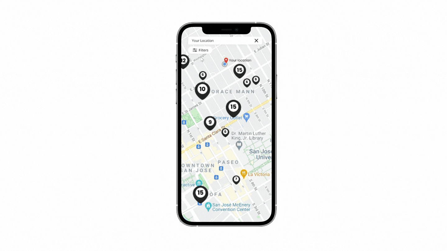
Map Visualization
-
Enabling location service for users to find a close by shelter
-
Numbers on the location pin to know how many spots are available for guest
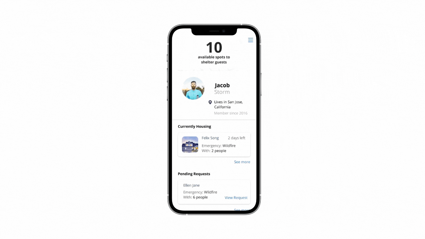
Dashboard for Hosts to monitor their listings
-
Track, manage and view all your available spots, houses and pending requests
-
Easily view the total available spots from your all your offered listing


Communication between Homeowners and evacuees
-
Stay connected with the Integrate messaging to allow evacuees to send questions, concerns or a thank you message to homeowners
-
No need to exchange personal information (your actual number)
DESIGN THINKING
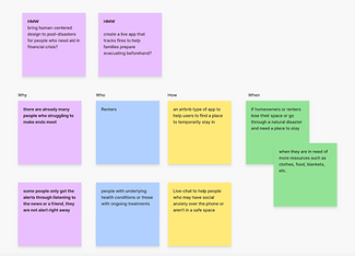
Initial Stages: The Design Sprint for brainstorming
Coming up with how might we statements and looking closely at the problems surrounding those statements followed by the series of questions, who what when why where helps the team to narrow down our ideas of what problem we want to tackle and figure out a solution.

COMPETITOR ANALYSIS
Alerts are not prompt enough, not enough time for those who need a place to stay immediately, slow response rate.
By conducting secondary research, we were able to better understand the situation of the problem.
We researched existing platforms and resources. According to our market research, we found that platforms and resources like American Red Cross, Nesterly, Airbnb.org and cowin.org offer resources and shelters. However, many of these shelters become available only after the unfortunate events of natural crisis occur.
The year 2021 has countless unforeseen events:
-Wildfires in the midwest
-Hurricanes in the midsouth
-Floods in the north
After speaking with the mentor and presenting our research, we were able to narrow down our focus and able to better understand the situation to come up with a solution. This allowed us to move forward to our designs to complete in a timely manner for the project submission for the hackathon event.
DESIGN
If we are seeking shelter, what’s the fastest way to find the spot?
This is one of the questions we kept in our minds when thinking about the evacuees after researching about the slow response rate that causes the user to feel anxious during a natural disaster situation. The team came together to talk about the task flow and userflow for the evacuees. This helped us sketch our own ideas that can help guide us to create the wireframes.
My Sketches

Teammates sketches


TESTING AND IMPROVEMENTS
Adapating sketches to low-fidelity wireframes

Low-fidelity wireframes that I was in charge of
MID FIDELITY WIREFRAMES
Initial Ideas + A New Direction
The team was focusing on how to find a shelter for the evacuees but was suggested by the mentors after presenting our mid to high fidelity wireframes, how can the homeowners offer their place? How will their account and feed look? How do we ensure both ends have an intuitive user experience?
We were also challenged with the thoughts on how to take this project to the next level if it were to be developed for the future. What further features can be beneficial for this community?
Major improvements in the design and implementation of the features
Filter + Map
We made changes in the filter options. We had the idea that the user can input the total number of people who need to find spots at a nearby shelter.
I found that the filter option is not visible enough and the user will have more options to choose from by adding more filter options that may be applied to their situation with a more clear label of the filter. I redesigned the left wireframe with the location marker to ensure the user will know where they exactly are located on the map with the text labels and red location marker.

How the user can narrow down their search results


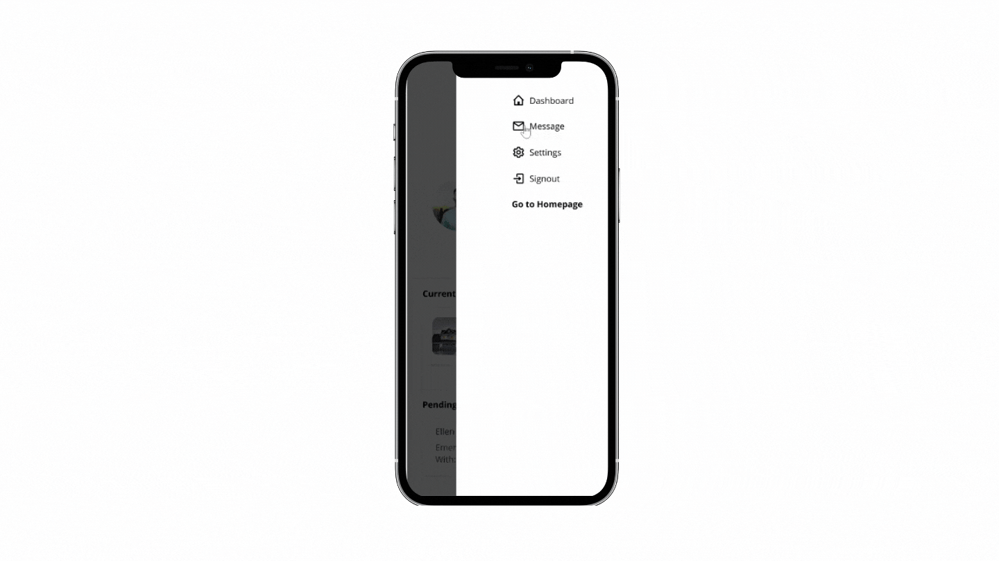
Dashboard design for host
With the given short time at the hackathon, all members divided themselves to create a dashboard for the hosts, giving us the freedom to interpret how we want the information to be displayed and what kinds of information should be displayed. This helped speed the design and iteration process because all three of us were able to pitch in our ideas.
We all made different wireframe screens, great! We came together to look at each other's screens to see what information is necessary to be displayed and how the text hierarchy can easily be read by the homeowner. One of the other major key elements of this dashboard is how the content is written and how it is displayed.
Team members had different ideas

Content writing: “Spaces available in your home” vs. “available spots to shelter guests”
We asked 5 people how they interpreted this message if they are a first-time visitor on this dashboard. We found that “available spots to shelter guests” is not confusing, and clearly means how many more guests the homeowner can take in.

Combining our ideas
I suggested taking elements from each person's screens which made it into the final design for our prototype. A clean interface which demonstrates clear text hierarchy combined with photos for visual representation creates a practical yet appealing dashboard that will be informative to the host with the appropriate content writing to ensure there is no confusion to the users.
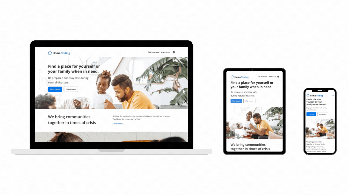
FINAL DESIGNS
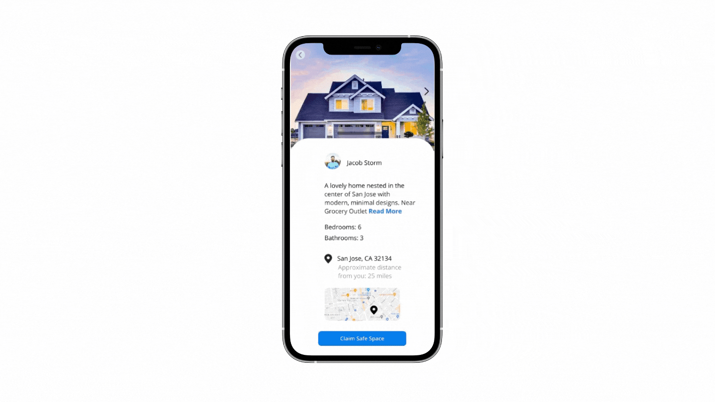
Welcome to HomeFinding


Claim a spot using the online form and notifications will be sent shortly

FINAL PROTOTYPE
Checkout the final prototype that was submitted for the hackathon event!
To checkout the official submission, here is the link to the project submitted on DevPost.
VISUAL DESIGN
Style Guide


Mood board inspiration

Source: Dribbble
Clean minimal interface that will be user-friendly because it caters to a wide-range of users
The color choice of blue was chosen to ensure accessibility for those who are colorblind. The overall website is to have high contrast typography, hierarchy with a friendly look to allow the minimal text displayed to not overwhelm the user with information. CTAs are clearly stated with the landing page so that evacuees and hosts know where to click. Because the website has a main focus to make sure evacuees can find a place within a short time, the primary CTA is for the evacuees.
CONCLUSION + LESSONS LEARNED
What I would do differently next time
Creating a persona -- This platform has two different target audiences, the homeowners and evacuees. The time constraint led to the team to focus on only one party, the evacuees instead of the homeowners. It was a learning challenge to create two different experiences for two parties. However, this helped me think more about how to design an experience that will be intuitive for multiple audiences and future add ons for an existing platform.
Designing for the homeowners’ side was a challenge due to the interpretation of the content writing. We asked several people how they will interpret certain parts of the screens that we provided. If given more time, I would like to have a user testing on the content writing on all the pages to ensure clarity.
Due to the time constraint, user research with user interviews would be beneficial for this project. Although the mapping and filter features seem very common for searches, I would like to know what categories and filters people will actually look for.
Considerations in looking ahead beyond the hackathon event
Create a network for community organizers to connect with homeowners who are interested in opening their home
List services and resources for natural disaster victims who are unsure how to proceed after a crisis
Live updates on air quality, current conditions, and recent affected areas
Check out my other work!

WAYFINDING | ACCESSIBILITY
Paveaway. End to end mobile app
Creating an easier way for those with physical disabilities or mobility issues to report damaged and faulty infrastructures.
Code-Launch 2021 Semi-Finalist
Creating an easier way for those with physical disabilities or mobility issues to report damaged and faulty infrastructures.
Code-Launch 2021 Semi-Finalist