
End-to-end Mobile Application
THE PROBLEM
Those who are physically disabled or have mobility issues encounter damaged infrastructure of pavement roads, which affects their daily lives.
Currently people, especially those with physical disabilities or mobility issues, encounter damaged pavements or missing sidewalks, which increases their travel time or cannot get to their desired location. After the attempts to report the problem to their corresponding cities regarding these infrastructure, it did not receive proper attention to be repaired.
OVERVIEW
Project Context
Collaborating with 5 other UX Designers and the key stakeholder
Creating the first version of the end-to-end mobile application prototype
Tools:
Figma, Miro, Survey Monkey, Maze, Otter.io, Octopus, Flowmapp, Tacqtic.io
🎉 Outcome
Secured next phase of development and completed V1 of the prototype for handoff to developers
Contributed to the development of the start-up project which entered in the semi-finals for a start-up competition
My Role:
UX/UI Designer
Product Designer
Duration: 5 weeks
Client: Misty Burch

STAKEHOLDER'S GOALS + THE SOLUTION
Create a mobile app where the users can navigate and report faulty infrastructures to increase awareness that will lead to an increase in the safety and quality of life in the community.
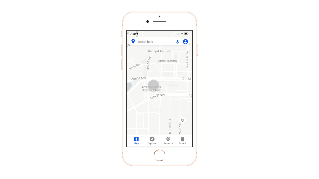
Paveaway is a navigation and reporting app that allows users to report faulty infrastructure to increase awareness and the quality of life in the community while also navigating users around infrastructures.

THE OPPORTUNITY
Paveaway can help those with physical disabilities navigate environmental barriers that obstruct their path. Users will be able to report information on the location, photos and description of the infrastructure. This will be able to increase their safety and quality of life in their community.

Sending reports on faulty infrastructure
-
Users can take a photo and upload an image of the faulty infrastructure
-
The ability to the pin the location , describe or use the filter option to describe the faulty infrastructure
Re-navigating around the obstacle
-
After sending in the report, users will automatically be re-routed to go around the obstacle to arrive safely at their destination!
-
Users will also have the option to not re-route

Design Process
Research
Define
Ideate
Design
Test
Secondary Research
Competitive Analysis
User Surveys
User Interviews
User Persona
User Journey
Information Architecture
User Flow
Crazy 8s Sketching
Low to Mid Fidelity
Final Prototype
High fidelity
Features
Usability Testing
Affinity Map
USER RESEARCH
Learning about our audience and competitors through research
Assumptions
Discuss any assumptions before the research phase to avoid bias.
-
Only those with physical disabilities are interested in this mobile application
-
People who are using government services are not getting attention
-
Will able-bodied people contribute to the app?
Research Goals
-
Discover reporting behaviors of users with varied disabilities
-
Identify motivation and frustrations with their current reporting process
-
Find out what users currently use to solve the accessibility problems they do face
Secondary Research
-
Poor infrastructure impacts ALL people and their safety, even able-bodied people
-
One billion people or 15% of the world’s population experience a form of disability
-
Transportation drives the economy, faulty infrastructure impacts thousands of people whether they are able-bodied or disabled
Competitor Analysis
A common trend of the user interface and features that was found in the direct competitors is included for the final product to create an intuitive digital user experience.
The common trends are:
-
Minimal UI designed for accessibility
-
Navigation applications using a route/discovery map
-
The ability to pin locations
-
Open to the public to allow community engagement to upload information
-
Filter options for accessibility
USER INTERVIEW INSIGHTS
A common pain point among our interview participants:
Feeling ignored by local businesses and government when it comes to accessibility issues.
Among the 8 participants who were interviewed, we seek insights from those who uses mobility aids such as wheelchairs, scooters or crutches.
The results of interviewing our 8 participants with a variety of disabilities to gain insight on daily commute or travel experiences validated our decision in developing the application to focus on the reporting feature — ensuring user’s voices are heard after the reports are sent to officials using our platform.

Empathy Map based on the user interviews
USER PERSONA
Meet James, The Self Advocator who often comes across faulty infrastructure on his way to a local coffee shop.
This user persona, James, is created based on the research and insights gained from the user interviews to guide us in the next stages — mapping the user journey. The user journey map ensures the features designed for the map will actually make an impact and create a difference for James when he comes across faulty infrastructure.

SITE MAP AND USER FLOW
A visualization to guide the designers in what pages need to be built out and what paths users might take.


Site Map
Userflow
DESIGN
Designing for accessibility — taking in considerations of different types of color blindness while having enough color contrast.
I created a mood board with various colors to check on the accessibility of our design choices. Color palette contrast, typography sizing and choice of images to reflect the diversity of our users and their disabilities was considered when creating the mood board.
How most people see these images

How people who are colorblind see these images

To follow the client’s art direction in adhering to the theme of “bold and empowering” I chose a blue tone color, which is often used when designing for accessibility.
How most people see this
People who are colorblind will see this
DESIGN SYSTEM

IDEATION + SKETCHES
Rapid sketching to flush out our ideas and solutions to influence the designs for the high fidelity wireframes that best creates a seamless and intuitive user experience.
Due to the time constraint, the team took part in a common activity found during Design Sprints, “Crazy 8’s Method.” This led to an open discussion of our ideas in how we imagined the features and layouts of the mobile application. The high fidelity wireframes are heavily influenced by some of the sketches shown above.


REITERATING LOW + MID FIDELITY
Log in screens
Original
-
Sign up and log in with Facebook and Google are not clear
-
The input fields are not the most common or best design practice for accessibility


Iterations
-
Use of white space
-
Buttons are clearly defined
-
Clear use of hierarchy
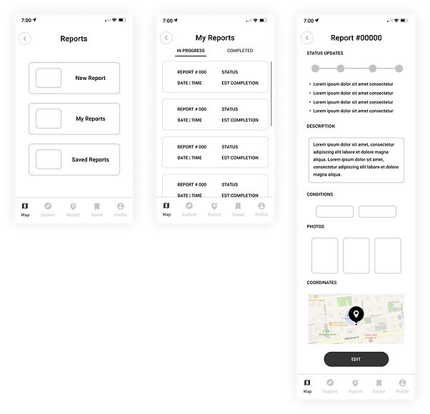
Report and report summary screens
Original
-
Lack of hierarchy
-
Spacing of the text is cramped

Iterations
-
The slide buttons for “in progress” and “completed” are more clear to the users
-
Typography hierarchy is more clear
-
Sections are clearly divided for the report summary screen
Reflecting on the iterations
I proposed these iterated screens as suggestions for the final designs for the prototype to be used in the usability testing. It was difficult at first to figure out how to visually layout certain parts of the screen because I did not want to overwhelm the users with so much scattered information. I tried to design the screens in such a way that is is easy to follow, with clear visuals and typography hierarchy.
HIGH FIDELITY / FINAL DESIGNS
Onboarding
Reporting Flow
Tapping on the report icon to submit a report
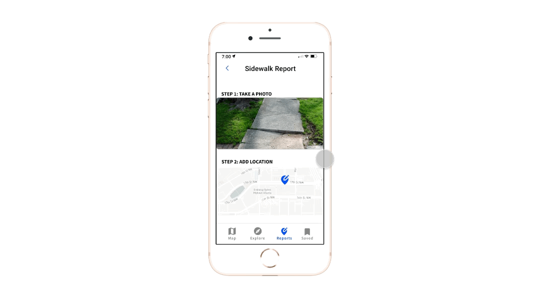
Overview of the filled out information before submitting
Checking submitted report
KEY FINDINGS
How did we do?
User interface is simple and the application is convenient but there is always room for improvement.


Affinity Map showcasing the different outcomes of certain tasks from the usability test
After analyzing the results from the test, we created an affinity map where we grouped together the insights to help us empathize with the user’s successes and failures.
The users found it difficult during the reporting flow and were not able to recognize the report icon.
Overall, the users enjoyed the experience of this mobile application and liked the idea to conveniently report a broken sidewalk.
USABILITY TESTING
A total of 56 participants took part in the usability testing to validate our design decisions.
6 moderated
50 unmoderated
The purpose of this usability testing is check the overall design decisions to create the user interface and the user experience of the following flows:
-
Sign Up and Log In
-
Routing
-
Reporting
-
Rerouting
-
Report Summary
LESSONS LEARNED
What I would do differently next time and further learnings
The Importance of Wireframes and Ideation
Wireframe designs require more time for refinement to achieve better results for the final designs. If given more time, I wish the team and I spent more time on the sketching and wireframing phases.
Testing different ideas
By testing the wireframes with paper prototyping or the low fidelity wireframes will allow the designers to have less bias and assumptions on what “the best design approach” will be in designing the user experience for our users.
Continuation to learn about designing for accessibility - ACCESS TO ALL
In the digital world, everyone has access to products. These products has potential to impact people everyday, most of the time in a positive way. This product that I created with a team to design for a wide audience always me to be more knowledgeable and aware of the audience. I learned and wish to continue to be mindful with all my design decisions.
Check out my other work!


UI/UX DESIGN | NAVIGATION
HomeFinding. Connect homeowners with evacuees
WINNER @TechTogether Boston 2021
-
Best Hack to Build Community and Bring the World Closer Together with Facebook
-
Best Social Hack
Creating an easier way for those with physical disabilities or mobility issues to report damaged and faulty infrastructures.
Code-Launch 2021 Semi-Finalist