
TireCraft Burnaby UX Case Study
Overview
A conceptualized project to redesign TireCraft Burnaby, British Columbia’s website that is focused on usability improvements to help users navigate to find tires best suited for them and easily schedule appointments on across multiple platforms.
PROJECT SUMMARY
Redesign
My Role
Who else was involved in this project?
This project was collaborated with the developer Ian Nguyen and mentored by Raphael Marcques.
UX/UI Designer
Key Contributions
-
Conducted and prepared online user interviews with transcripts
-
Designed UI for the responsive website for mobile, tablet and desktop versions
-
Validated the prototype with users to gather feedback for the next iteration process
-
Identified opportunities and user pain points to improve the usability of the website
PROBLEM
Usability testing indicates that many users were not able to search for the suitable tires for their cars and could not easily schedule a service appointment through the online form
User research and usability testing was conducted to understand the user experience on TireCraft website. Usability test shows that the users had trouble with is searching for tires and scheduling a service appointment through the online form
SOLUTION
Redesigning the information architecture and layout of each page so that the users can easily navigate through the website.
By using common design patterns and using the research insights from the user research and usability test, I was able to meet my project objective goals, redesign the website on 3 platforms that shows the improvements in the usability.
USER RESEARCH
Users who are car owners only need the basic needs to find parts and maintaining the car to get from point A to B
I conducted user research through surveys and interviews to understand their process in maintaining their cars, especially if they are car owners. This guided me in structuring how I would like the users to interact with the website during the usability test. By understanding who will use an automotive website, I will be able to create the scenarios for the users and observe their interactions with the site.
USABILITY TESTING + UNDERSTANDING THE USER EXPERIENCE
The results: Major improvements in delivering a user-friendly website to easily navigate through the site and search
THE RESULTS
What the current site does well:
Informative on the products and services provided by the business
What could be improved based on the user research:
Navigation
Removal of the “Contact Us” button when scrolling
Create a user-friendly responsive website for users to:
-
Easily book service appointments
-
Search methods by defining and organizing an improved hierarchy.
INFORMATION ARCHITECTURE
Organizing the information for the website so that the user will be able to navigate through the website intuitively
Task Flow

User Flow

Site Map

The creation of the sitemap assisted me in organizing the information architecture to ensure all webpages are organized in such a way that will be beneficial for the users to navigate the redesigned website. The task flow indicates what the redesigned website solved to solve the user's pain point in navigation through the website.
FINAL DESIGN

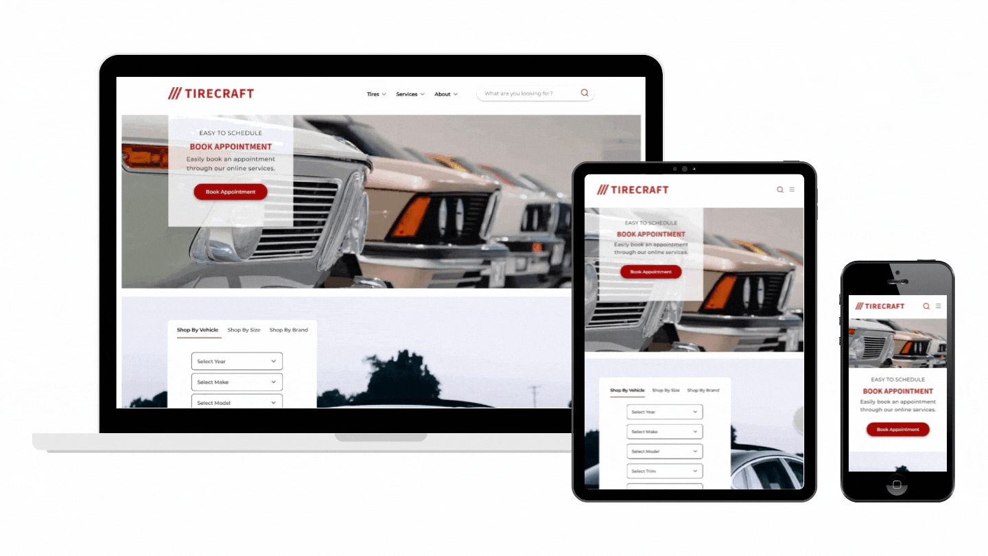
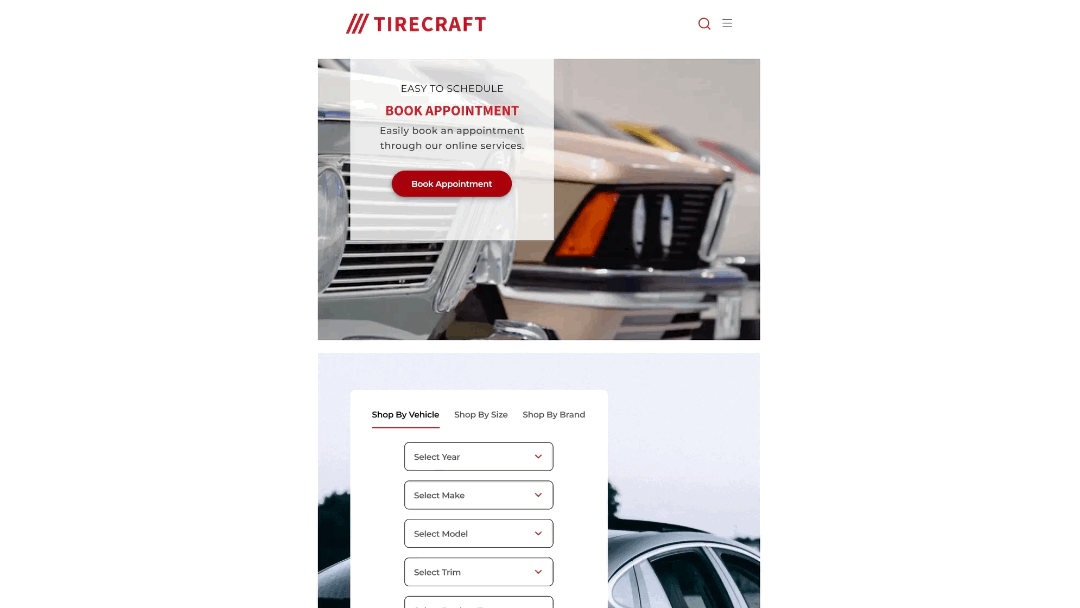
Homepage/Desktop

Homepage/Tablet
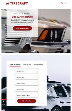
Homepage/Mobile
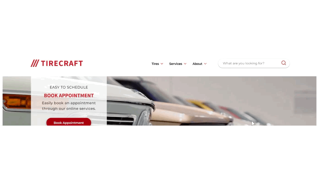
Top of the Homepage
Overview of the homepage
Navigation
Navigation Bar / Desktop

Navigation Bar / Mobile
Navigation Bar / Tablet
Through the usability test on the current TireCraft Burnaby website, users found it difficult to find the online form to schedule their appointments. The redesign of the website has clear and minimal designs for users to easily navigate through the website. Users will be able to easily find the tires they are looking for and easily schedule their appointments through the online form.
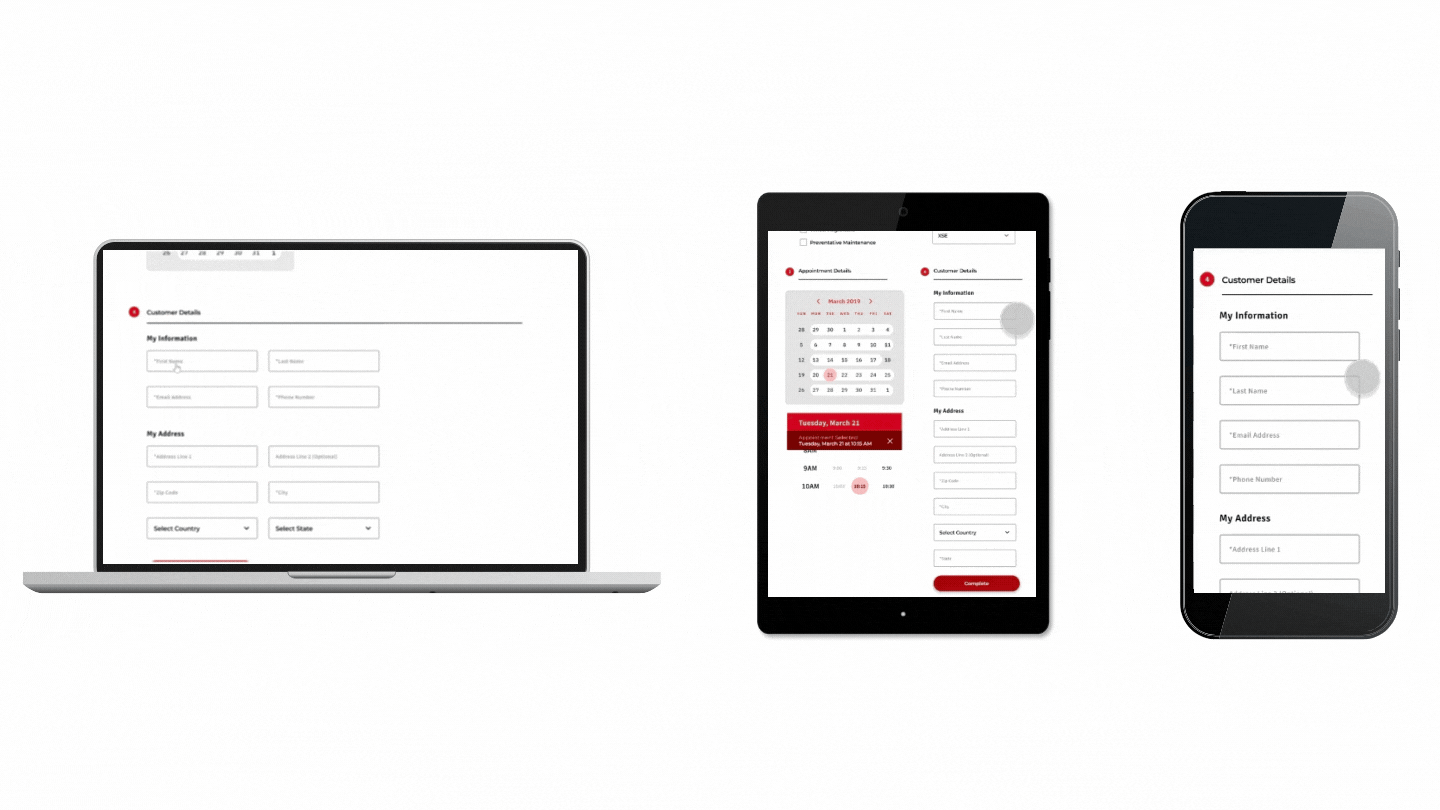
How the trigger warning functions across the platforms
There is a clear indication for users on all platforms to know if the input field is required to be filled. This allows for an easier flow of inputting information when users schedule an appointment through the online form.
VISUAL DESIGN

Color palette

Typography

Design System


Users visiting the website across multiple platforms
FINAL PROTOTYPE
Mobile (Designed on iPhone SE)
Tablet (Designed on iPad Mini)
Desktop (Designed on Macbook)
LESSONS LEARNED
Key Learnings
Mobile first to desktop
It was my first time designing a responsive website. I learned from this experience that it is best to design on a small mobile screen (iPhone SE or iPhone 8) before designing the desktop version so that it is more fluid in the development process.
Communication is crucial when working with with the developer
When it comes to handing off the designs to the developer, detailing the process and the reasoning behind each step and design is important so that the developer can understand what I envisioned. We found it useful when I was able to show the interaction of each button and screen to the developer so that he is able to understand the flow and look rather than reading my comments on the file.

WAYFINDING | ACCESSIBILITY
Paveaway. End to end mobile app
Creating an easier way for those with physical disabilities or mobility issues to report damaged and faulty infrastructures.
Code-Launch 2021 Semi-Finalist
Creating an easier way for those with physical disabilities or mobility issues to report damaged and faulty infrastructures.
Code-Launch 2021 Semi-Finalist